Gmail UI Review
Introduction
First, Kudos to the gmail team for the great features…I’ve put down a few of the observations, most of them from the users point of view and my personal experience of using gmail.
It is the obvious that we miss sometimes, and these are the finer details when missed make a great design lose its value. Great graphics create stunning pages, but just the right positioning, right font size and the right contrast can create a clean, uncluttered and nifty layout.
I’ve compiled a few of my observations and suggestions. There is no fancy graphics involved, it is simple fill colors and font size and positioning that has been changed.
layout of the message page
Before: as on the webpage
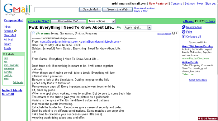
Observation:
Too much of white space and the contents seem to be suspended in no where. The page has white all around along with the ads and other info around. Contrast is something missing, which would help focus and defocus the content. The focus should be the message.
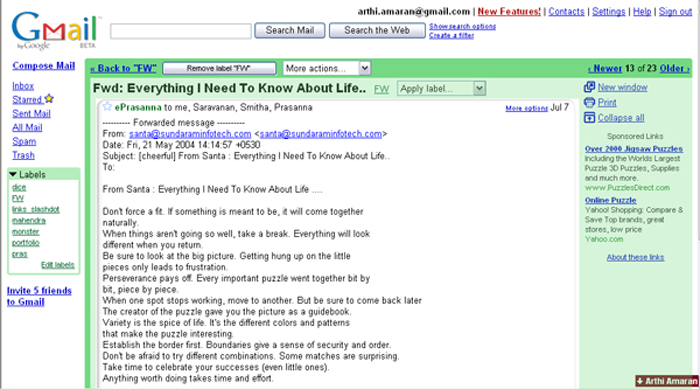
Suggestion:
So if the space around it has a subtle color fill the person still can focus on the message and the rest of the content can form a background.
After: with the color fill
layout of the label
Before: as on the webpage
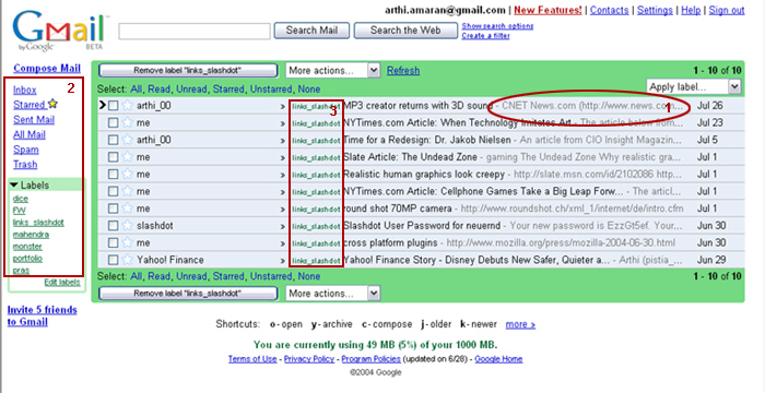
1)Snippets:
Observations:
The snippets clutter the inbox, even though the font colors sort of de-emphasize their presence. (refer figure above(1))
Suggestion:
It would be great to put snippets in a different column, so that there is spacing between the message subject and the snippet.
2)Font Size:
Observations:
Different font sizes for the Inbox and the labels. Since the labels have a smaller font size, one tends to ignore the new mails in the labels ( refer figure above(2))
Suggestion:
Labels share the same hierarchy level as Inbox. So same font size will establish the equality. Also, that way, one wouldn’t miss out on the mails with filters set to reach the respective labels (folders).
3)Labels –color:
Observations:
The green is not a strong color that stands out against a grey background. The readability is a little difficult (refer figure above(3))
Suggestion:
A different color that is prominent against the grey background
Feedback: a consistent spot on the screen for feedback would be helpful. Check the image below
After: with changes in the layout
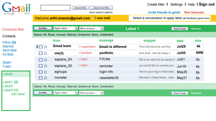
layout of the inbox
Before: Inbox as on website
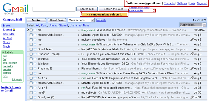
1)Help and tone of the copy: (refer figure above (1))
Suggestion:
When I just hit the report spam button, it would be helpful to get a feedback ‘select a conversation before you click ‘report spam’’, rather than get the feedback ‘no conversations selected’, which isn’t very helpful. Or there could be a context help menu next to it telling you what to do.
2)Create filter (refer figure above (2))
Suggestion:
If the ‘create a filter’ link would grouped along with the ‘settings’ and other links at the top right, it would fit well as its more of a preference setting (or atleast I consider it that way)
3) Links: (refer figure above (3))
Suggestion:
The links are a little cluttered. Check the image below for suggestions.
Interface:
Looks like the color scheme follows the Gmail logo. I can see the green, yellow and blue used a lot, but not the red. Maybe one segment could have the color red -either the search or the compose. That would be a strong color coding for positioning a person in the segment.
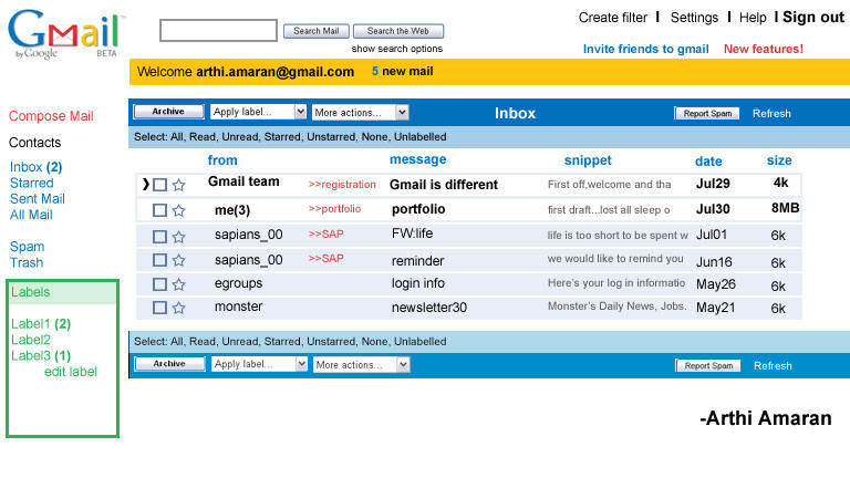
After: Inbox with changes in the layout and grouping of links
Some more observations…
Archive:
I was wondering if there was anyway of spotting archived messages in the ‘all mail’ folder -if there was some sort of a label that could be automatically attached to the archived message like “archive>>name of the label>>then the message”, readability would be better.
Select unlabeled:
The ‘select’ feature lets you select mails that are ‘read’, ‘ unread’, et al. If there is an option to select ‘unlabeled’ messages, it would help a lot, esp for someone who doesn’t take the time to label them. This would let me select and move all the unlabeled messages in the inbox to say ‘trash’ or attach a new label.I don’t know if this already exists, I did try to locate it but didn’t find it. So thought would just put in a word.
Sort by :
It would be great to have the sort by sender or date feature incorporated.
Multiple labels:
Any way to delete or undo the ‘Apply label’ feature, just to remove the second label applied, right from the Inbox? I know that one could go into the second label folder and choose the conversation and delete the label, but it would be nice if I could do it from the Inbox. (a feature like undo or something)
Compose and sent message feedback:
The feedback ‘Message sent’ is not very prominent. With a preview of the message sent below it, it gets a little confusing as to if the message was sent. Again if the feedback could be positioned in a prominent location on the screen, it would have helped.