Amazon UI
INTRODUCTION
The reason for a review on Amazon.com actually started out as a result of the feeling of ‘lost in space’, during a shopping experience. But as I did explore the various
segments, to write a review, I did find some interesting features hidden deep down in the pages. I think, it is high time that we fix the UI problems in the
website. All that is required is re-arranging and moving things around to bring in a meaning. It is very much like moving the furniture around to bring order to
an earlier chaotic space!
The intent of the review is to bring to light some of the issues, which when fixed would make
the shopping experience more enjoyable and intuitive and easy for all users
(naïve, computer literate and power users)
These are the criteria against which I will be evaluating Amazon.com.
Loading Time
Ease of Navigation
Language and Communication
Layout
Loading time is the time taken for the webpage to download.
Amazon.com pages are quite light (small file sizes) which makes them load fast. This is very good, especially for the time-starved users, who can’t wait for page loads.
The fast download has been a pretty positive feature of the website.
Ease of navigation is about how intuitive and easy is it to find/spot what one is looking for in the website. It depends on clear structure, a well laid out
Information Architecture and ample visual landmarks.
We might want to remember Kevin Lynch’s paths, edges, districts, nodes, and landmarks, the principles could also apply to way finding on the internet.In
other words, its about getting from point A to point B, how easy it is, how one doesn’t get lost, the visual pointers and guides that keep one focused and aid
in reaching that goal. This could apply to finding a product on the website, and the process of actually finding it.
Where am I?
Where can I go?
Where have I been?
These three from Jacob Nielsen’s Web Usability will be used to test the ease of navigation.
Store Structure:
The store can be compared to a huge factory outlet with various stores housed inside, each with their own subsections and deals of the day. Amazon has a variety of
different segments like Books, Electronics, Music, DVDs, etc and each of which have further subsections or ways to access information. For example, the Music store has subsections like Classical music, Browse styles and today’s deals and
others which basically give the user different ways to access information. This categorization meets the needs of various shoppers from casual browsers and
window shoppers who browse to see if they can find anything interesting, to those who’ve made up their mind on a particular piece of music. The search
feature within the store lets one locate a particular music. For shoppers who don’t have the patience to peruse through the information, takes them right to
that particular music they want.
The two figures below show the structure of the store, the space used for the navigation, advertisements
and main content
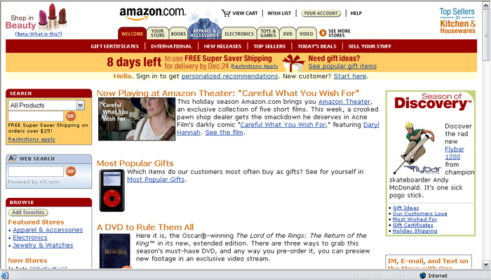
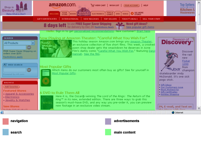
The navigation system consists of tabs, side panel links and bread crumb trails.
Tabbed Navigation: (refer figure below (1) )
This is useful, as it categorizes the various segments or stores, each of which in turn have subsections. This places the user in context of the store, acts like an
invisible wall that demarcates the activities of the segment. Within each of these stores, the subsections cater to shopping needs of variety of different
users.
Side panels: (refer figure below (2) )
The left side panel has menus that are contextual, giving the user more options or suggestions during shopping.
Bread Crumbs: (refer figure below (1) )
These trace the path of the segment and help with navigating between the different levels.
Where am I?
The homepage icon (Amazon logo) serves as a Visual Landmark, a very important component of way-finding on the e-store. This hot linked logo takes the person
to the homepage any time a person is lost. Its location in every page also places the user in context and assures the user that he/she is still part of the
Amazon.com’s turf.
The tabbed menus, along with a unique color coding acts like a visual cue to place the user in the context of the store.
Where can I go?
The tabbed menu that consistently stays at the top, links the user to the other segments of the store. The link ‘more stores’, lets one explore the various other stores that
are not displayed in the tabbed menu panel. So the user at any point can quickly navigate to other places of the e-store.
Where have I been?
There is a history of the pages /products recently viewed at the end of the page. (“Your Recent History”- maybe a different terminology would make it sound more
user-friendly. In fact, the “Your Recent History” sounds redundant in the presence of “Recently viewed products”.)
Ok, so what’s missing and what are the gaps in the website?
Observations:
Here is my observation…
The ‘See more stores’ feature of the tab menu:
There are a few stores that are listed in the tabs. In order to shop from a different store, I go click on the See More Stores option and when I select say “DVD” A new tab
gets appended to the existing tabs, which is a good feature. Now, when I try to browse a different store and get back to the DVD again, that’s where I find it
frustrating. The moment I go to a different store, the new DVD tab that was appended disappears and I will have to go again to See more stores and select
DVD again. It truly has a fleeting existence.
Suggestions:
The addition of a drop down menu ‘See more stores” would be a better option, as that way, all those tabs that get appended could be accessed at anytime without having to go
through a two step process of visiting a different page to get access to the store again.
Ease of navigation:
Browsing and spotting the product should be easy enough. Thanks to the product search feature, that lets the user locate the product in the store. Otherwise, the
navigation system constantly is inconsistent, making the user feel stranded. The navigation system changes from links to breadcrumbs and then morphs into tabs
and this inconsistency doesn’t help guide the user. Although all the pointers are present, they change location in various pages making them less readable and
useful.
Overwhelming information:
The store is huge, and definitely houses a huge selection, but is it necessary to overwhelm the user with all the information, all those categories and all those umpteen
options? Sometimes, too many options tend to confuse the user and gets in the way of shopping. Simplify Simplify Simplify! This is the mantra. The
information architecture needs a revamp and a different organization to speak the language of the user and make the shopping experience enjoyable and easy.
How friendly does the site appear? How is the tone of the language? Is it jargon-free? These attributes of the language and communication set the dialogue between the user
and the website.
Observation:
Overall, the language is a little cold and the website has a lot of information, which are presented as information, but lack the personal touch, or the warm friendly
dialogue.
“Sign in using our secure server”
“The secure server will encrypt your information. If you received an error message when you
tried to use our secure server, sign in using our standard server. “
Suggestion:
Good old plain English please…
Is this really necessary? Would the user understand what this means? This is basically exposing the dirty laundry of the site. Technical jargon is a big no-no and the language
has to be modified to the user’s understanding. This additional information only makes the user wonder if it would be a good idea to sign in using a standard
server. (Forget about what the word “server” would mean to a user) Maybe the language should change from the geek/tech vocabulary to the language the user
speaks.
The location of the graphics, text in the page, the visual design of the website are elements of
the layout.
Observations and suggestions:
\The layout needs to be consistent across the various pages. The menus, advertisements and promotional content should occupy consistent location on the screen. But, does
the website do all that? We’ll explore that now…
Consistency:
Inconsistency rules!
Location of menus and links are constantly changes in some instances.
The side panel menus that have secondary menus and the ‘browse by’ links sort of disappear the moment the person clicks on a link. Actually, they just relocate themselves to a
different location below the tab panel, and are so inconspicuous that the user tends to feel the menus are lost. Even if one manages to spot them, the menus
are named differently. There is a bread crumb trail on the top that places you in context, but, once to go up the level, there is another page, with a totally
new look. There is this feeling of being abandoned or lost in space in many instances of the shopping experience. Each page is so different, that they don’t
seem to belong to the family of the store. Thankfully, the top band still retains the color of the segment, which is like the faint glow in the darkness
of ‘lost in space’.
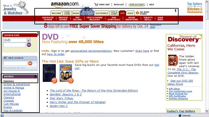
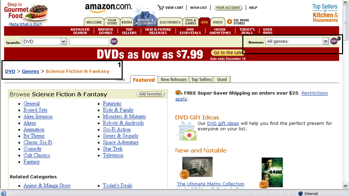
The two
figures below show how the ‘Browse’ (a) link changes location in subsequent
pages. In the main page of the section it occupies the side panel.
Once the genres are chosen, it moves to the upper right half of the screen.(a)
In these 2 figures, you see
the inconsistent navigation system and the change in the layout of the pages
within the same section. The first figure has the breadcrumbs (1).
In the second figure, the page the user gets to when he/she clicks on the
‘genres’ link in the breadcrumbs (1), the bread crumb disappears and the
user lands in a page that is totally different.

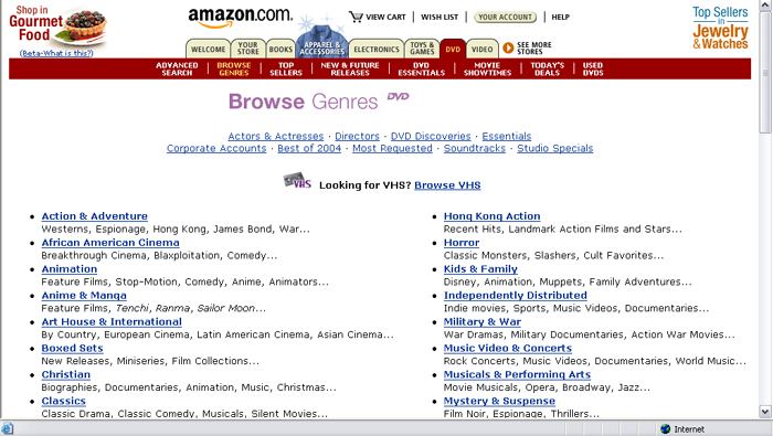
The menu system that constantly morphs into new forms is one primary reason for the inconsistency. The other reason is the changing location on the screen.
Anchoring the side panel in all the pages within the segment would be of tremendous help to give that consistency. Although the reason for the relocation
of the panel is to accommodate advertising and more content, it is necessary to try and accommodate it some place, where it would be retained in every page. The
content of every page should have some set guidelines that establish consistent layout.
The layout has a lot of white space, which is good. But, sometimes, the space is not well defined, that it makes the content float in space. More organization and
positioning of the content at appropriate places would help.
There are some segments like ‘Expert Advice’ or ‘Customer ratings’. Wouldn’t it be good to create a place for them, so that the user can easily spot them? Right now, its
difficult to spot some of them in the huge load of information on the screen.
Graphics and font types can be used a lot more effectively to emphasize and deemphasize segments of information.
Outbound links…
For instance, in the Electronics segment, the subsections aren’t actually part of it. Some of it open up new tabs with further subsections. There should be a way of
identifying them to be outbound links (links that open up new tabs)
Customer support number:
There is no support phone number listed in the help files. Shouldn’t that be listed? Infact, I had to look up at Google search to get Amazon.com’s support number.
Help:
It would be a good idea for the help pages to load in a different page, so that the user’s shopping process is unhindered. Also if the user wants to cross reference before
checking on the FAQs, it will help to segregate it from the main shopping window.
Check out:
This
figure shows the checkout page.
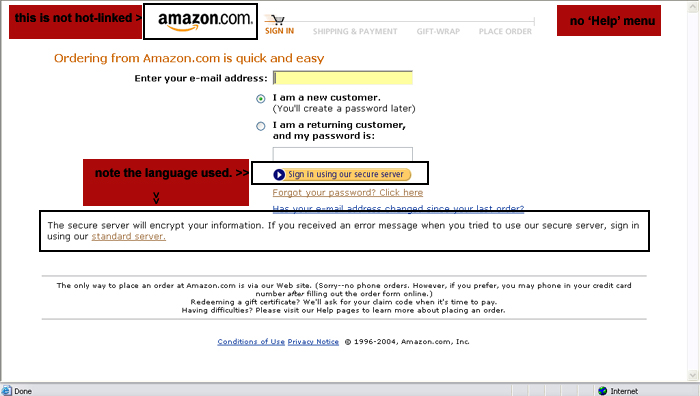
The checking out process has a few buttons that occupy the right half of the screen in the
area of advertisements, which might make the user, ignore it and search for the link elsewhere.
This is the point when you feel completely stranded. The amazon.com logo on the top of the page, is not hot linked. There is no ‘cancel order’ button
in the order page. There is no ‘help’ link too. Aren’t they very important?So once the check out window loads on to the existing page, you step
into an alien land and further complications in the check out process only add to the frustration.
No Log out/Sign out button:
The most glaring lacuna is the absence of the sign out or log out button. In order to log out, one has to search for sign out in the help and then you’ll find that log
out button, which is hidden in the depths of the webpage structure! Shouldn’t there be an easier way to log out?
The number one concern is the lack of landmarks and lack of consistency. There are a lot of nifty features, great customization options and lot of information, which is not reaching the customer, as they seem to be hidden or lost in the pages. All those
efforts to create them seem to be for naught, if the user doesn’t spot it. The UI has to be designed to bring out the intrinsic values and present it
in a fashion that it reaches the intended audience. There are a few glaring lacuna like the logo not hotlinked in the check out pages and few other gaps
that have been neglected. “God is in details”-Meis Vanderohe. It is the small fixes that would solve great problems. Infact, if the UI is well
designed, it would significantly reduce the number of phone calls to the support personnel. And it definitely doesn’t hurt to have a good looking
website with great functionality. The UI design doesn’t add frills; it actually brings to light the great work that goes on behind the screen.