Cooper UI
INTRODUCTION
This is part of the Visual Design test for an application for a Visual Designer position at  www.cooper.com
Further info at
http://www.cooper.com/content/company/Visual_Designer_Test.pdf
PART 1
How do the visual design choices shown here enhance or detract from the user’s experience? Write down a few thoughts.
from www.cooper.com(visual design test)
OBSERVATIONS
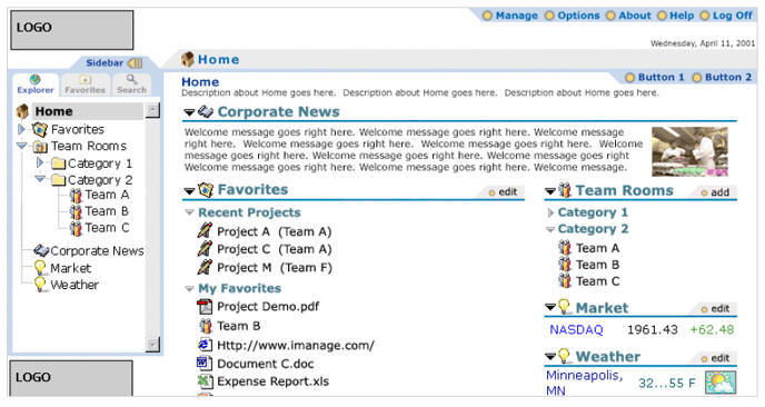
Sidebar:
The Explorer Tab:
The inclusion of “Favorites” in the Explorer tab and also having another tab “Favorites” is just repeat of information.
One alternative would be to remove the “favorites” from the Explorer tab and retain the “Favorites” and Search” tab
Another would be to include “Favorites” and “Search” in the Explorer tab, thus simplifying the navigation and removing those tabs altogether. (this depends on the complexity of the information and the tree structure)
Logo:
The logo at the base is not really required.
Top bar:
This is a good segregation of the the general administrative links. Making the “log off” link more prominent (either by a different color or a larger font) would further facilitate easy spotting especially when one is in a hurry.
The graphic (yellow circle) for each of these links resemble radio buttons, maybe a better integration with the text to form a single entity would help. Or if they are just meant to act as a separating element, vertical bars as dividers will do a better job
Gray Strip:
That’s a good element, that keeps the person in context, telling him where he is in the site.
If the color of the font would match the color of the font in the sidebar, it would further help in reinforcing the message.
Adding Explorer –>Home would identify it with reference to the tabs in the sidebar.
Main content area:
The text “Home” is again a repeat. The Description could directly go there without the need for a heading.
Button 1 and Button 2 is a little confusing. There is no need for those tabs.
The information is all scattered in the space…it seems floating and suspended in the white space. The screen real estate is not been used effectively.
Instead of the two column layout, a single column layout would be better, as the columns are not divided equally.
The corporate news section can be at the right half of the screen.
That would group all the information which could be edited/added on one side and information that is just to inform or be read is kept on the right side of the screen space.
SUGGESTED CHANGES
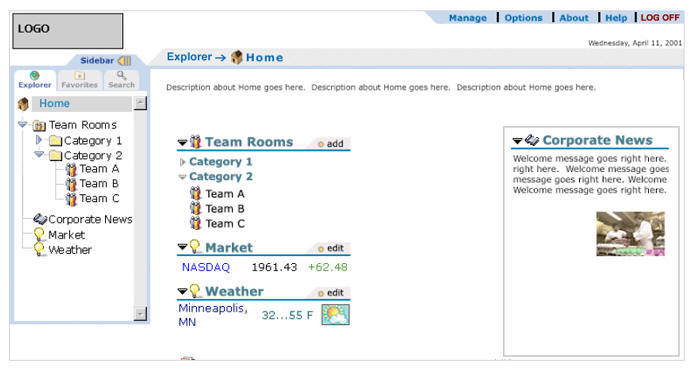
Home page (revision)
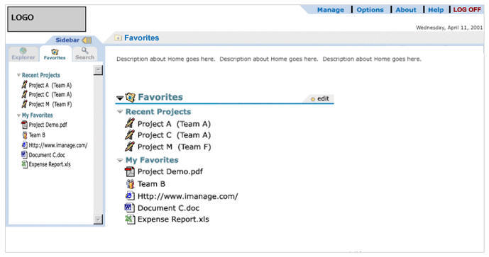
Favorites page (revision)
PART 2
Create a visual design interface for a PDA
Objective:
Create a visual design that enhances the usability of the screen, as well as adding aesthetic appeal.
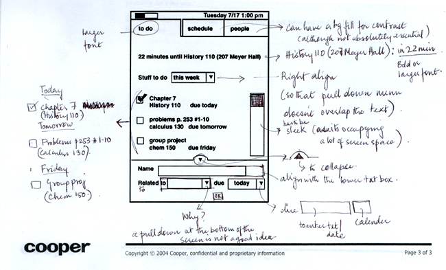
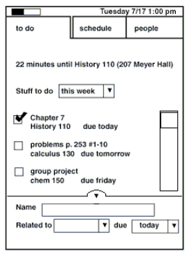
Before:
Suggested changes:
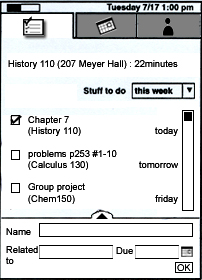
To do tab:
texts have been shuffled and the Due days have been right aligned for easy spotting and scanning information.
Stuff to do tab has been right aligned so that it doesn’t overlap the main text area below.
New entry:
The lower segment has a calendar along with a text box for better functionality. A button “OK” is added to confirm the new entry addition.