Slashdot UI Review
INTRODUCTION
Ok, this is a website for nerds and geeks…The content is the focus, accepted. But I guess it doesn’t hurt to make the content easily readable.
Though I wouldn’t say its got a great interface, I can find my way, I’m not lost, as the constant presence of the Navigation bar on the left keeps me in context.
OBSERVATIONS
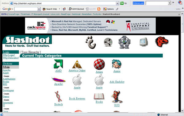
This particular page shown below is one that bothers me the most. It is so difficult to focus or scan through the topics to locate the one I’m looking for. The reasons being…
1)Residual white space:
Too much of white space between the icons (topics). The information is suspended and scattered in this white space.
2)Too many icons floating in the space. Six columns of icons spread all over the screen, the eyes can’t scan them at one glance. Too much of eye movement from left to right that makes reading them difficult.
Screenshot of the Topic page
![]() http://slashdot.org/topics.shtml
http://slashdot.org/topics.shtml
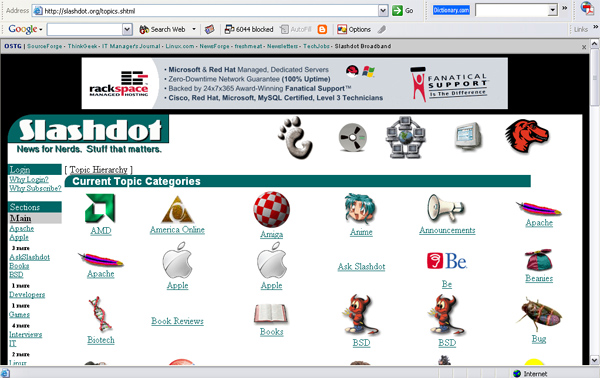
Suggested Changes: (refer figure below)
If the same content was organized into 4 columns and the space between them reduced, it would help focus better, read and scan the information better and eventually make the layout a lot more organized and clutter free.
Positive white space:
The white space now serves better to let the eyes focus on the information.
Topic Page with suggested layout