Webmonkey UI Review
INTRODUCTION
I was looking for some reference material for flash, when I happened to notice a couple of navigation issues in webmonkey. So here’s the documentation of my observations and a simple solution that might help alleviate the issue and place the webpages in context. This is not a complete dissection of the website. Keep checking for additions to the observations…
The problem:
Getting back to the main menu was difficult from the sub-section menu, as the secondary location of the main menu was inconspicuous and separated from the content of the page by the advertisement.
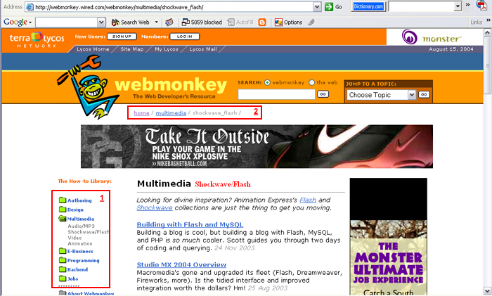
Page1:
(refer screenshot 1)
1)This is the location of the main menu
(‘the how to library’). This is occupying a prominent position that one might not miss.
2)This is the secondary location of the main menu. This area is separated from the main content by the advertisement, that actually makes its presence
unnecessary.
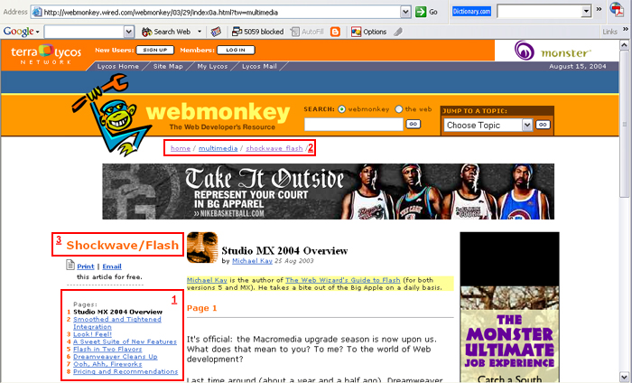
Page2:(refer screenshot 2)
The main menu (‘the how to library’) sort of disappears, with the sub-section menu (‘Studio MX 2004 Overview’) taking its place(1). The first page has the main menu on the left side, which would make one assume that it would be consistent across the pages. Unfortunately, it disappears and the person is stranded, having to hit the browser’s ‘back’ button to get to the main menu (‘the how to library’) or the ‘Multimedia-shockwave/flash’ homepage, even though there is a secondary location of the main menu (2), which is inconspicuous, so misses attention.
The simplest solution would be to hyperlink the ‘Shockwave/Flash’ title(3) to take one back to the ‘Multimedia-shockwave/flash’ homepage, which in turn has links to the main menu. This would place the page in context and prevent the user from getting lost.