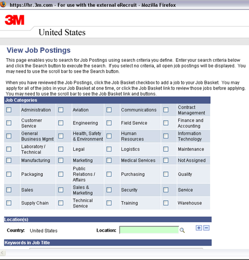
This is 3M’s job site. (Refer Fig.1)
The first time I was in this page, as usual I tended to ignore the text and started looking for the keyword entry textbox, before which I tried to choose all the job categories. I expected a ‘Select All’ option, but couldn’t find one. So I had to go through the excruciating process of having to check every category. How could anyone not think of adding ‘Select all’ or ‘any’ as an option?
 Fig.1
Fig.1
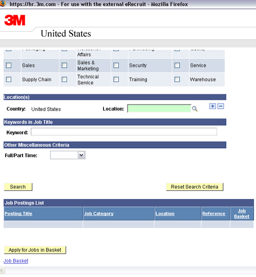
After my best though futile attempts to gloss over that lack of care for usability, I scrolled down to find the ‘Keyword’ field and entered the keyword and hit ‘Enter’ on the keyboard. Instant refresh and results are displayed…an empty ‘Job Postings List’. I assumed that there were no job openings, but it didn’t work even if i didn’t enter any keyword (as the knowledge i garnered through years of being online taught me that there should be all the open positions listed, if I don’t key in a specific word). (Refer fig2)
 Fig.2
Fig.2
Only after a couple of tries did I realize that when I click on ‘Search’ button using the mouse it display the results. Shouldn’t all the buttons accommodate keyboard short key access?
I’m in awe at how attention to details has become a rarity and sometimes even some basic requirements too fall into that category!
Aren’t we all accustomed to hitting the ‘Enter’ key every time we login to check emails?
Imagine how terrorizing the very thought of having to use the mouse click to perform search on Google or logging in to email clients!
Just hope someone reads this and does something to alleviate the pain that a job-seeker already has to go through.