COA Signage
INTRODUCTION
The picture you see below is the signage at the elevator core at each floor in the architecture building, Texas Tech University. We had an earlier one with plain numbers without any information about the rooms. I could atleast find the room numbers easily. It was just stark black numbers on a white background with pointers in red. (Sorry… i don’t have a picture of it) This new one was designed I guess to add a few more details to guide people to find their destination based on the room numbers or the names. But, all this has done, is added a few more clutter, which doesn’t let a person getting out of the elevator quickly find the information required. Also the wrong elements have been focused and de-focused which is not serving the purpose well. I’ve tried to pick out a few of the design flaws here…
GENERAL OBSERVATIONS
Signage at 5th floor
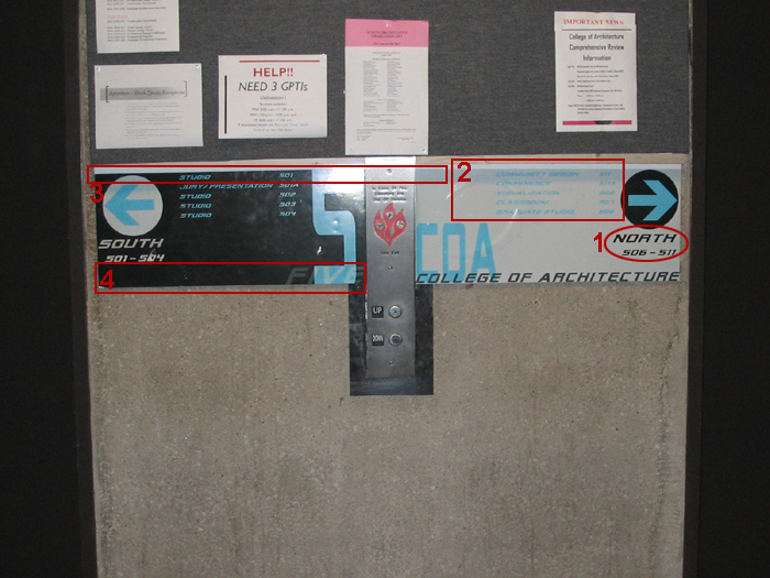
The first thing that strikes me is the number ‘5’ (which is good, esp when all the floors in the building look the same) and then COA (which is not good, as I know I’m in COA) .Next is the orientation arrows (ok, but doesn’t require so much of a focus), then I see the North and South text .This is not as essential as being able to see the room numbers to locate the studio space, which unfortunately is the last thing I discover in those few moments of stepping out of the elevator. Ok, now for those descriptions…its ok to find them last, as it is for a person who is trying to read the description to find the room. So de-emphasizing that is fine. But, contrast and varying lighting conditions weren’t considered during the design process.
The use of different colors for the northern segment and the southern segment is a good idea, as this whole chunk of black creates a stark contrast.
SPECIFICS
1) When I step out of the elevator, I need to be able to quickly glance and find the information I want. I wouldn’t want to search in a clutter. This signage has a lot of information. I don’t think I’m interested in knowing which is the north or the south (orientation is not my biggest concern when I’m trying to locate the Viz studio). (Refer to the image above(1))
The room numbers should be the primary focus of the signage- so it has to have the largest font size. The orientation is sure helpful , but it has to be tertiary information.
This is the hierarchy as I would list
1) Floor number
2) Room numbers
3) Room descriptions
4) Orientation/COA/Floor number
2) The foreground color is not so strongly differentiated from the background. The light blue is not readable against the white background. And with poor lighting /power save mode, it just gets worse.(Refer to the image above(2))
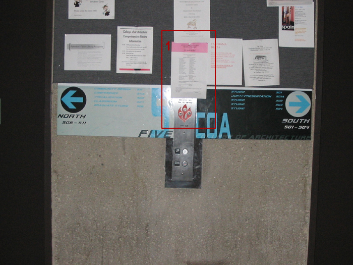
3) The pin up board always casts a shadow on the signage and that’s where some important information resides. If some thought was put into the ‘site’ and the ‘site conditions’, the design would not be what it is. The tertiary information could have gone there. (Refer to the image above(3))
Also sometimes the pin ups overflow which leads to some information being obscured or hidden. (refer image below(1))
4) This is the area where the important information could reside. but unfortunately the space has been wasted.(Refer to the image above(4))
This is no attempt to criticize the designers- it is a part of my new found interest of dissecting interfaces and signage and see where scope for improvement resides in design.